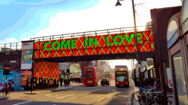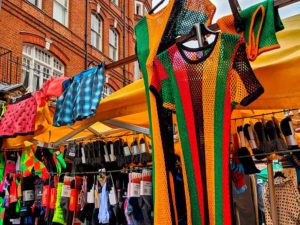

Iconic string vests in Brixton Market were among the things that inspired the winning entry in a competition to design a new look for the bridge across Brixton Road.
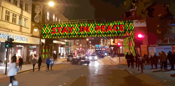
When the outgoing “B OUR GUEST” message disappears, in its place will be a bold geometric design with the words “Come in love” and “Stay in peace”.
Public involvement and paid work for 11 young people are key features of the new design (above) chosen for the bridge across Brixton Road.
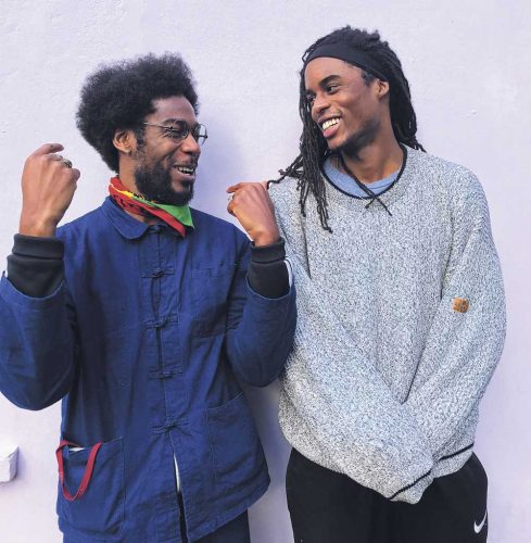
Behind the entry that caught the eye of judges for the competition organised by the Brixton Design Trail are architect Farouk Agoro, designer Akil Scafe-Smith and visual artist Annie Nicholson.
The text for the project will say “Come In Love” on the north side and “Stay In Peace” on the south side. They plan small workshops of local people to explore the development of the final colour scheme.
The whole process of applying the designs to the bridge will be recorded and shared.
“We wanted to create something that archives and expresses the essential character of a place that has deeply shaped both our pasts. Returning the favour, we’ve also offered two guiding principles for Brixton’s uncertain future: PEACE and LOVE,” say the three.

Architect Farouk Agoro (left) with designer Akil Scafe-Smith
Akil Scafe-Smith designed a temporary pavilion in 2016 for the Brixton Design Trail which organised the design competition with Lambeth council.
Cllr Jennifer Brathwaite, chair of the judging panel, said: “We were so impressed by the breadth of submissions and wide engagement from local, and especially, young designers. “Farouk and Akil’s winning design is an intelligent and bold response to the brief, and a powerful message which speaks to the present and offers a welcome and parting gift for Brixton’s community and those passing by.”


Not a fan. A diamond pattern with a truly corny message in a dull font. Oh well, can’t please everyone I guess.
Brilliant!
Can’t help but feel ‘come with love’ would have been better.
‘Come’ jokes ready…..