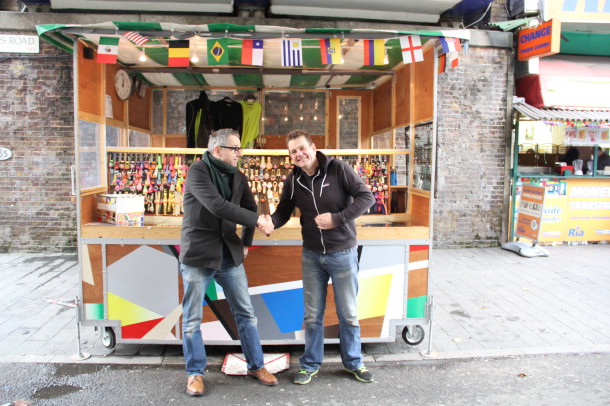
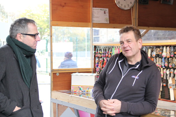
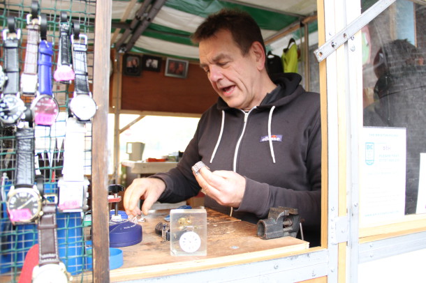
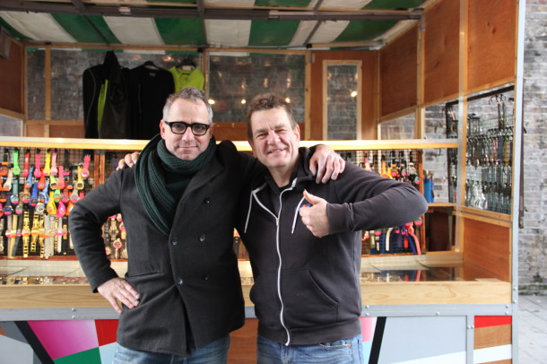
 “We were here before Wahaca!” says Stuart Horwood, stalwart of Brixton market, watch-man, and CEO of the Brixton Market Traders’ Federation. Horwood means, specifically, the strikingly colourful paintwork of his stall was in the off before Brixton’s latest chain-restaurant branch opened only a few metres away. Horwood knows the market intimately – to celebrate 30 years of trading in Brixton, he decided to refresh his kiosk on the corner of Pope’s Road and Brixton Station Road, and invited locals to contribute to the design. He was introduced to local artist Mari Reijnders by a mutual friend, and their labours blossomed into an iconic design that compliments the dynamic Horwood. He and Reijnders talked to the Brixton Blog about their collaboration:
The pair were introduced by Reijnders’ wife, Rachel, “who used to work in the community market round the side there,” said Horwood, “and because this is the new stall, about April time I started to get paint done on it, and I started asking people I know – artistic sort of people – if they would like to come along and contribute to it, and I absolutely hit the jackpot when Rachel introduced me to Reijnders.” The artist was excited by the prospect of working on the stall, presenting as it does a particular sort of challenge to someone used to working in two dimensions. “I’m an artist,” he said, “and I do all sorts of different projects but when this came up, I just started to think about it and I got more and more into it. I made a little model just to give Stuart an idea of what I was going to make. I did a plywood box of the whole thing with just the sides painted, and I was working off that model. Then I showed it to him, and he liked it.”
The model sits on the stall while Reijnders finishes its jazzy paintwork. Unsurprisingly, the ongoing facelift garnered a bit of attention from passers-by. People commented “all the time” said Reijnders, who lives in Electric Avenue, “I know the market really well and I’ve lived here for a long time. Now there’s more direct contact with people. There were a lot of people I knew before from their faces, so it’s like lots of people comment on it all the time.”
Horwood’s regulars have had plenty of opinions on changes to the stall. “Ooooh yes everybody loves it! Which is fantastic. I mean it’s definitely raised a few eyebrows – it is kind of a standout thing – and yeh I’m just absolutely thrilled with it.” Despite being CEO of the Traders’ Federation, and a deft watch-man, Horwood knows his limits – he wanted an artist’s eye to beautify his kiosk. “It was just a blank canvas for so long,” he said, “and to have Reijnders come along and do this – it’s just the best thing as far as the new stall’s concerned, and I just love it.”
If Horwood has his way, the rest of the market could follow suit – some traders adjacent to his kiosk have stalls, which don’t have the same semi-permanence or potential for decoration. “I’m talking to Lambeth council at the moment to get some kind of kiosks in the market. But that may take some time.”
Reijnders’ inspiration came mostly from the kiosk itself. “This one folds up, that’s also part of the design. It’s like a fold-up painting,” he said. “The whole back folds in, and it gets wheeled into storage. I dont’ know what project will follow this, but it’s been really enjoyable. I’ve done certain things like this, or that look a little bit like it. Because I knew it folded up – it doesn’t refer to anything, it’s not like ‘this means that’ or anything – this is a three-dimensional object, so I started painting on every side at the same time on the model.” The abstract design looks more thought-through than it is, it seems: “And then I didn’t really bother trying to work it exactly to match, although it looks quite matching. That wasn’t on purpose!”
Prior to the kiosk project, Reijnders made “a series of paintings that look like they have been packed, by someone who packed them really badly, so they put the tape of the transporter over the paintings, and they look a little bit like constructivist paintings.” The dynamism of that project went with Reijnders to design the kiosk – the market environment affected the result, albeit subconsciously. “It’s a really vibrant thing and I wanted to add to it, and I also wanted to leave it open. It was one of the things Stuart really liked, like you can still see wood and I think that really works, that you don’t just completely fill it up with colour blocks.” Horwood agrees with this honest approach to the redesign, “because it is a wooden stall,” he said, “I’m not trying to make it into anything that it isn’t, and yeah, you know it’s sort of just really lively. It works with the rest of the market. I think it also works really well with the clothes hanging on the other stalls – although, like you said, it’s not something I was completely aware of doing. When I made it, those kind of coincidences, they add to it I think.”
“Oh, and the disco ball will be returning!” Horwood chimes. Er, a market stall known for its disco ball in residence? “Ooooh yes! But getting it up isn’t as straightforward as people might think…”
Horwood will be officially unveiling his revamped stall on Saturday December 13 from 4pm. You can even take home an original piece of Electric Avenue art from the event – on sale will be a special series of 45 paintings by artist Mari Reijnders.


