Dalton Maag may not be the first two words that spring to mind when people think about Brixton.
But the work of the type design company that has been based in Brixton for more than 20 years is seen every day by millions of people across the globe.
From the ninth floor of Blue Star House above Nando’s on Stockwell Road, more than 40 employees with 20 nationalities and speaking 12 languages produce typefaces that are crucial to organisations ranging from tiny to huge.
A leading typeface seller recently described it as “at the forefront of innovation in typography and with a portfolio of high profile clients”.
But perhaps it is appropriate that the world-leading company has a relatively low profile locally.
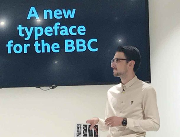
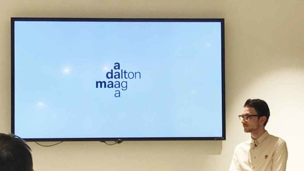
As Lukas Paltram, its creative director, told a Brixton Design Trail event last night (21 September), some typefaces are designed not to be noticed, but to make reading easier.
In Squires architects’ newly opened Department Store building, he joined David Bailey, creative director of user experience and design at BBC design and engineering, to discuss just such a typeface.
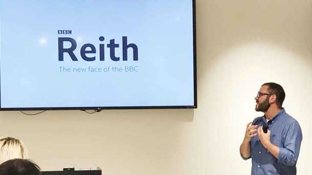
Reith, named after the first director general of the BBC, will become the giant corporation’s corporate font – its public face for the world.
To create a typeface that will be used in dozens of languages on platforms from smartphones to giant hoardings, the BBC chose Dalton Maag.
Paltram and Bailey took their appreciative audience through the months of work involved and the big importance of minute details for legibility and readability.
For the highly focused Dalton Maag, working groups of 20 people were large – not so for the BBC.
But what has been created – and will continue to be developed for a long time – is going down well. Even the snarky comments the BBC expected for such an exercise were fewer than usual, said Bailey.
Not only will Reith replace typefaces now used by the BBC which were designed for print alone before anyone had thought of the internet, but it will also save the BBC a lot of the money it spends licensing those typefaces for hundreds of users.
Dalton Maag’s work with Google, Amazon, Intel, and Nokia may have been one reason it won a contract with such prestige and worldwide impact.
But not all of its typefaces are designed to ease your eyes through the small print on screen.
The organisers of the 2016 Rio Olympics came to Dalton Maag in Brixton to create a distinctive font, designed both to ignite the public’s imagination and to leave an enduring legacy.
Affordable studio space was a driving factor to settle in Brixton, says the company, but “even more so it was the diversity and vibrancy of its community that are so important to maintaining creative inspiration”.
It looked at moving close to central London “but we realised that our roots are firmly in Brixton.
“Our work reaches audiences around the world and can be seen in most people’s day-to-day life, be that on an advertising billboard or on a mobile device.
“Amazon’s campaign that saw Brixton Tube station full of its posters featured letters that were created in our Brixton studio.
“It’s from Brixton where the good things come.”


